Solution
What are the crucial functions of the site that need emphasis? How will the final project look and feel?
Style Tile
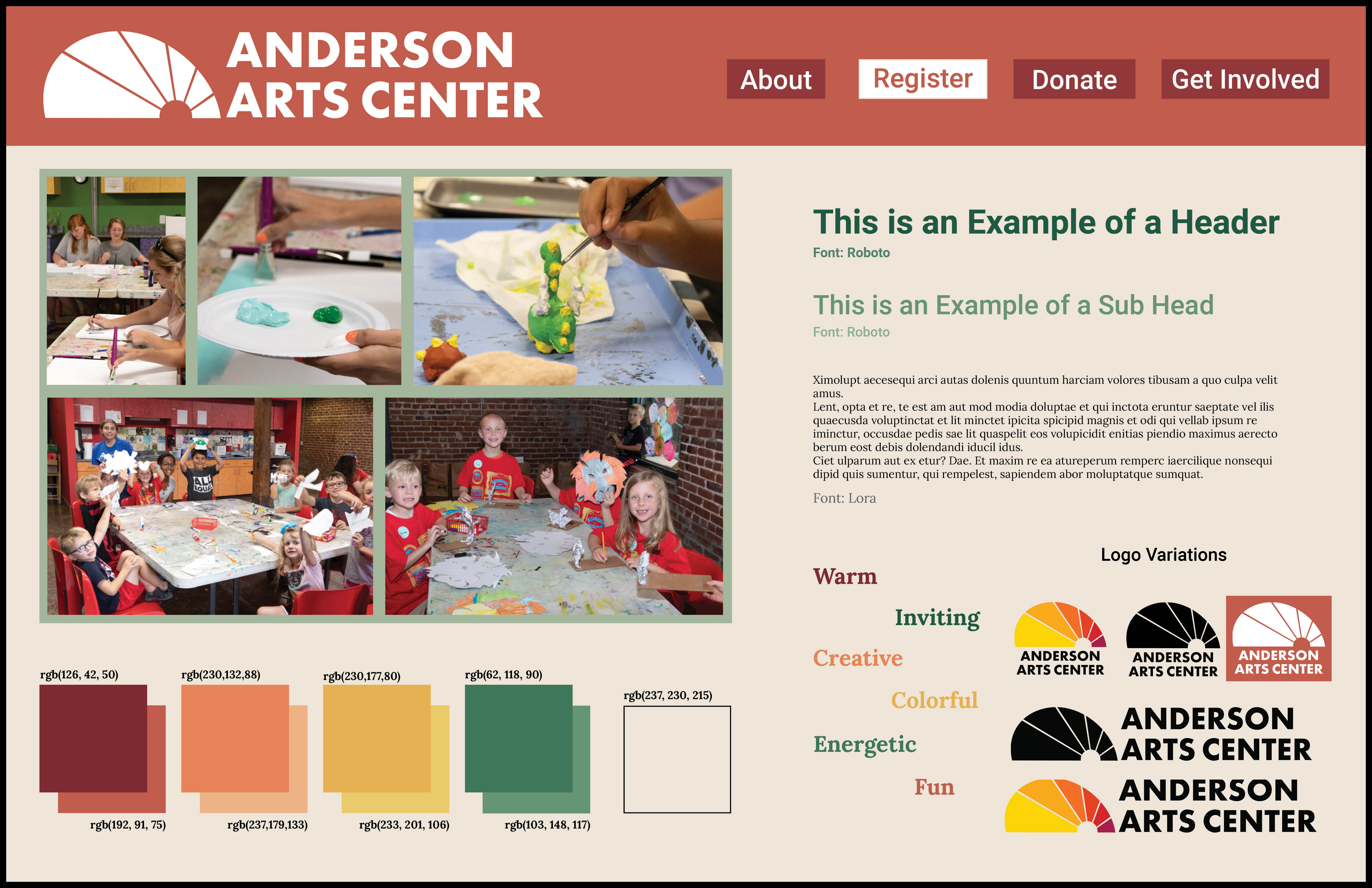
The Heading
At the top, I created what a possible navigation bar might look like. I used color to emphasize the importance of the register button. It is frequently visited by users and is the CTA (Call to Action) button. The buttons along the top are also important to the user but are only a few of the buttons that will be featured on the final site. They are there to give an idea of what the heading will look like and what categories will be present.
Aesthetics
A key feature in the Arts Center’s architecture is the beautiful stained glass windows in the galleries. The current logo is modeled after the stained glass. They have a pattern of a sun with rays shooting out with various blocks of color. When refreshing the logo, I wanted to keep the iconography the same but make it a vector image because the current logo looks pixelated. I created a square version of the logo as well as a horizontal version to better fit in the navigation bar. I also created black and white versions of both logo orientations to work for various background colors. I used the warm colors in the current logo to match the feeling that I want to convey with the site. I want the site to feel warm, inviting, colorful, creative, fun, and energetic. I have colors listed at the bottom of the Style Tile that is warm and inviting with hunter-green to contrast. The hunter green also comes from an architectural feature of the Arts Center. There are hunter-green railings around the historic building. The use of this color alludes to the building itself as well as the history of it. The warm colors with the green provide a cohesive color scheme with variations in saturation to fit the website.
Text
I used Roboto for the heading typeface and Lora for the text body. Roboto is a sans-serif typeface and Lora is a serif typeface. Both are simple and easy to read. They won’t distract the reader from the information, and hierarchy is used to draw the reader’s eye throughout the webpage. The majority of the website will be warm, but the headings and subheadings will use hunter-green to contrast and emphasize hierarchy.
Call to Action
What does the Arts Center website need to emphasize as a priority for users? What actions do they need to take? Through research and interviews, I determined that registration is the most important to the user and the most beneficial to the Arts Center.
Registration
The Arts Center offers a variety of classes and workshops every week. A button for registration will provide an easy way for parents to sign up their children for classes. The button will be easy to find and will make registering fast and efficient. This button will lead to a page that lists all current classes, workshops, and events. From there, the user can register for the respective activity.
An example of how the CTA button will be displayed is shown on the navigation bar on the Style Tile above.